Gamifying "The Work" on a Project Management Platform
Contracted by client Leantime.io, myself and two other UX/UI designers reimagined what a project management software could do to motivate, and even delight users as they catalogued their workflow.

Role
As a member of an agile team, I was directly responsible to keep our workflow managed, conduct and document research and analysis as well as creating multiple deliverables for our final designs.
Client
Leantime.io
Timeline
3 Week Sprint
(June 2023)
Tools


What is Leantime and what makes it unique?

-
Leantime is a project management software, much like Asana, Monday.com, Jira, ClickUp, and countless others. These platforms help users to keep their workflow organized, timely and collaborative...among a host of other features depending on the platform.
-
Leantime is intentionally, no pun intended, much leaner than other platforms as Leantime considers itself a project management platform for the "non-project manager", more focused on the individual contributor.
-
The platformed is uniquely positioned as open-sourced, allowing developers to build the platform out based on their needs. However, for the sake of this project the client wanted us to focus on the "plug & play" version.
What are our goals & opportunities?
As our brief was focused on motivation and engagement, we decided to focus on the most challenging user, the individual contributor. These users are responsible for incremental workflow input and engagement, and not overall management of the project.
Project Goals & Opportunities
-
Increase Leantime's individual contributor engagement and motivation to utilize the tool
-
At the completion of a three week sprint, deliver a functional prototype to spec, research report and presentation to the client
-
Integrate a bespoke motivational concept, offering value to "tedious" work
-
Devise a solution that works in conjunction with Leantime's current UI, without modifying it
-
Offer this new concept to individual contributors who are often the least motivated user group to consistently use the tool
What can we learn from competitive/comparative research?
When researching other project management platforms we found:
-
Most features were centered around visibility of progress
-
Collaboration was heavily incorporated
-
Various ways of viewing tasks were always featured

This got us thinking...What does motivation look like in the digital world?
In order to further understand user motivation and engagement we needed to be platform agnostic and see what digital motivation and engagement often entails:
-
Progress tracking and advancement was heavily utilized
-
Social aspects motivated users to engage with the platform
-
Rewards gained (no matter how intangible/worthless), were key motivating parameters

User Research: What are active users saying?
We wanted to know the full scope of our target audience's interaction with project management platforms, so we decided the best way to understand their attitudinal, behavioral and habitual responses to these platforms would be to ask them directly.
We interviewed 7 users of various platforms from a diverse industry set, whom through past experience had used 12 different project management platforms.
-
Every user interviewed was an individual contributor, reporting to a Project Manager who oversaw the workflow process.
-
All participants were daily users of project management software, as it was part of their responsibilities.
What we heard from user's to further empathize with them

I really enjoy collaborative elements of project management software and working in real time with coworkers

At times it does feel like an endless "to do" list and forward momentum feels elusive although I'm completing tasks

I appreciate seeing social feedback in real time that acknowledges that the task is complete

I appreciate the visibility to understand what I'm currently accountable for and even seeing what's been done
Making sense of everything we heard from users
Gathering all of the collected data from our user interviews, we distilled this raw data into similar themes/categories looking for insights. Documented below is the 16 different themes/categories we were able to uncover.
Affinity Mapping

Of these themes/categories, we decided to focus on four of the most relevant themes that we would use to solve for our target demographics goals, needs and frustrations. From those themes we were able to glean actionable insights.

Satisfying Actions
Users feel immense gratification when visualizing task completion

Visual Progress
Visual indicators help to understand progress and accomplishments

Social Engagement
Social engagement increases work enthusiasm and immersion

Feedback
Receiving positive acknowledgment is rewarding for users
How can we further empathize with user's pain points, needs and goals?
Developed from an amalgamation of all our research where we defined the needs, challenges, and goals of our target audience uncovered thus far, we created a single, fictitious "persona" in order to further empathize with their challenges, enabling us to fully immerse in our user's mindset.
Goals
To complete tasks from his to-do list
To stay on track with his work progress
For his work to be noticed and validated
Needs
Visualize task status and completion
Feature to show his current task status
Easy interaction with others
Frustrations
Completed tasks don't clearly show completion
Uncertainty about path to completion
Often feels like a "silo" work environment

Elijah
Product Engineer
Sausalito, CA
We then mapped out the process that our persona would experience as he goes about his workday, executing his workflow to the best of his ability. We learned Elijah's pain points, frustrations, and emotional experience through each step, in order to identify design opportunities within each touchpoint of the platform.
Action
Elijah logs on to the project management system to find his tasks
Elijah completes his first task
Elijah receives zero feedback from the platform or socially from bosses/collegues
Elijah moves on to his next task, hoping his previous task will be approved eventuallly
Feeling


Opportunity
Showcase Elijah's progress thus far and his path to overall project completion along with his task list
Acknowledge "small" victories on a platform level
Allow for both the platform and colleagues to see Elijah's accomplishment and validate his work
Create visual feature to showcase his continuing progress, increasing morale and motivation
How do we translate our research into practical design?
Taking all our accumulated takeaways and insights we ideated and prioritized features that would be incorporated into our concept and solve for our user's pain points goals and needs through design.
We began this process by entering into a 'design studio' with parameters in place to have our research directly dictate and inspire our Lo-Fidelity (hand-drawn) designs.

Kanban View
All tasks in “New” Stage
1

Kanban View
*Task moved from “New” to “In Progess”
** Progress advancement
2

Kanban View
*Social feedback from collegue
**Tasks advanced
*** Progress advancement
3

Kanban View
*Reward Earned for Completion of tasks
**Tasks Completed
*** Progress advancement
4
As we conceptualized our design framework and features based on our accrued research, we noticed that our primary feature, essentially an animated progress bar, which was automated based on task completion status, accomplished a number of motivating and engaging factors that all fell under one main category:

GAMIFICATION
Visual Progress
Ability to see the entire workflow at a glance including progress made and future task completion needed to achieve a goal
Fulfilling Actions
Acknowledgement/feeling of achievement with a tangible reward system based upon productivity
Social Engagement
Provide the ability for colleagues to send motivational messages regarding a users progress/accomplishments
Feedback
Systemwide graphic reactions which are directly tied to every productive action taken by the user
Design Development
After putting pen to paper to design lo-fi sketches we were clear on the elements that would be integrated into Leantime's existing platform. Due to time constraints we decided to go directly to Hi-Fidelity designs in order to undergo usability testing and make all further iterations within Hi-Fidelity.
Visual Progress

The ability for the system to show your real time progress based on productive actions. We created two separate indicators. "XP" often used in gaming refers to "Experience Points" which denotes how much progress you have made thus far (in this example 15XP is the amount needed to complete the sprint). Each completed task earns a specific amount of XP based on time, effort, etc.
Fulfilling Actions

We devised themes that connote progression to show you how far along you are on your journey with tangible advancement indicators as tasks are progressively completed
Social Engagement

We created social messages to send to colleagues as they progress through a collaborative project
Feedback


Understanding and visualization of how rewards are gained through progressive actions, (i.e. as a Kanban card worth "3 XP" is dragged from In Progress to Completed "3 XP" will be added to your total XP, progressing closer to the goal XP amount
As progress journeys are completed trophies are earned. The trophy is representative of what theme you were building upon.
*i.e if your path was building a house a finished house would be collected.
How did our designs perform in Usability Testing?
A Note on Testing:
The intention behind testing was to qualitatively evaluate:
-
Comprehension
-
Motivation
-
Engagement
-
Fulfillment
Due to the complexity and subjective nature of qualitative testing we asked follow up questions regarding the previously listed qualitative measurements, took meticulous behavioral and attitudinal notes, and documented any verbal reactions to the usability test, all of which informed our next iteration.
Visual Progress

Key Learnings From Initial Testing
-
Participants didn't understand the theme and what they were working towards
-
Animation was very slow and users didn't even see "XP" on card or the total XP advancement indicator on the actual thematic progress tool
-
As we were using our persona's image and telling people they were at work as "Elijah" and showed them the image initially they didn't connect in a fulfilling way with his progress
Social Engagement

-
Most participants didn't even see the social message, which was a photo of the sender and a "great job" emoji
-
The users who did see it didn't understand who the photo was of and why emojis were being used once someone completed a "sprint" and began a new one
-
Feedback was made that the two photos were competing with each other and they were unsure of who was who, adding to the confusion of being our persona "Elijah"
Key Learnings From Initial Testing
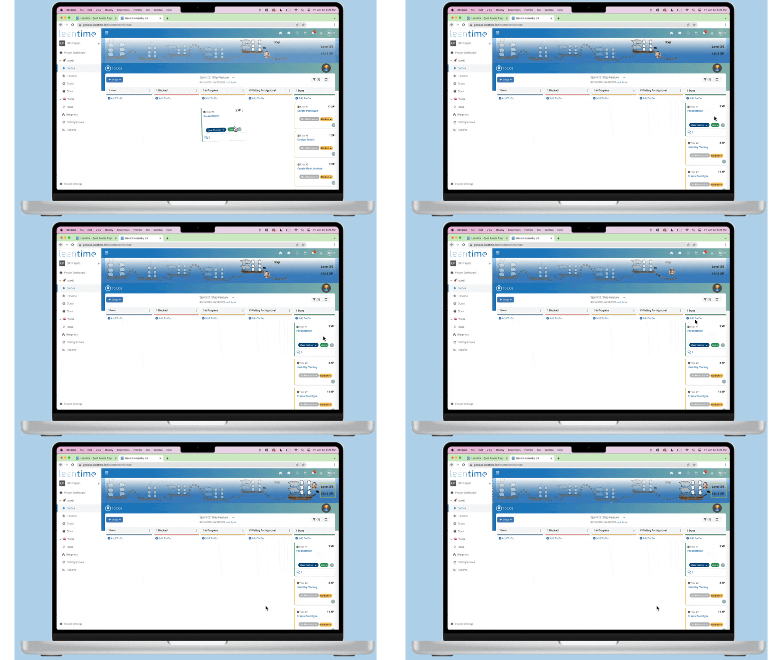
Fulfilling Actions
-
Transition was very slow and most users didn't even see the total XP advancement indicator on the actual thematic progress tool
-
Although the XP advancement indicator on the thematic progress tool was completed as the goal 15 XP was acquired it wasn't initially clear that the goal had been completed due to the unclear nature of the theme
-
The reference to "levels" was unclear on the tool and what exactly a "Level" referred to
Key Learnings From Initial Testing
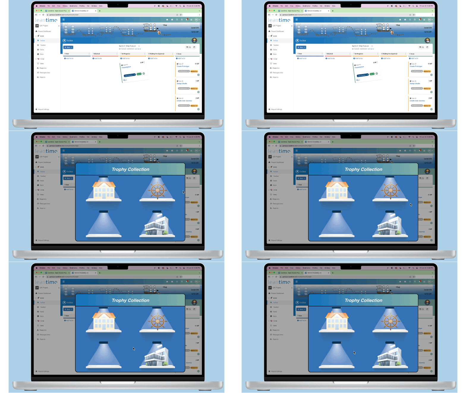
Feedback
-
Participants were unable to locate where they would see their "reward collection" within a reasonable amount of time
-
Participants were often unaware that when they completed the goal "XP" amount they would collect a reward
Key Learnings From Initial Testing
What iterative changes did we make after initial testing?
Based on previous testing we iterated on the designs in order for them to achieve the highest standards of motivating and engaging users
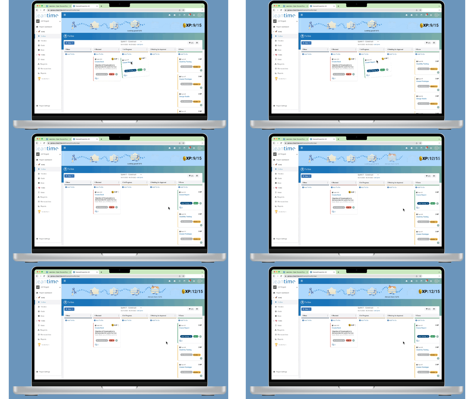
Visual Progress
Final Iteration
1
2
2
3
Changes Made From Initial Testing
1
-
Users found theme to be intuitive in terms of progression, i.e progress in building a house. Additionally, animation timing was adjusted for seamless progressive indication with added bounce fx
2
-
"XP" on card and total XP advancement indicator on the actual thematic progress tool was more prominent with addition of token icon and sizing, which led to increased engagement and comprehension
3
-
Progression used avatar instead of profile picture, lessening confusion although that can be reverted for personal motivational purposes
Social Engagement


1
Zoom View
Changes Made From Initial Testing
1
-
The placement of messages was moved into a more prominent position
-
The message was interactive, needing to be clicked in order to read the contents, instead of disappearing instantly after reception
-
The message clearly stated who it was from and included text instead of just an emoji
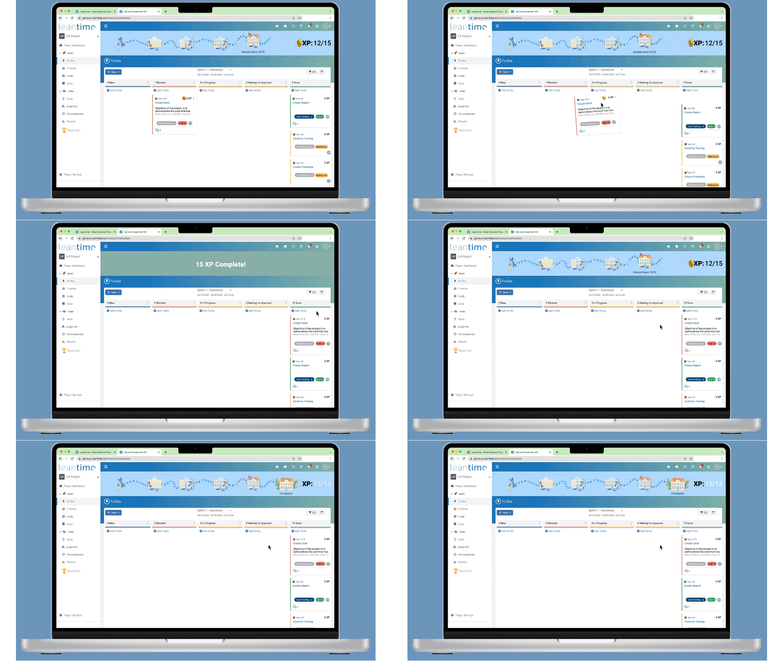
Fulfilling Actions
Final Iteration
1
2
Changes Made From Initial Testing
-
The transition speed was optimized for seamless comprehension of XP gained
1
-
Users found clarity of XP progress much easier to comprehend with the addition of banners that were added to the thematic progress tool to inform the user that all XP goal "points" had been completed
-
The XP Advancement Indicator total changed state illustrated by the animated transition from static black during the entire journey to completed white
2
Feedback
Final Iteration
1
2
Changes Made From Initial Testing
1
-
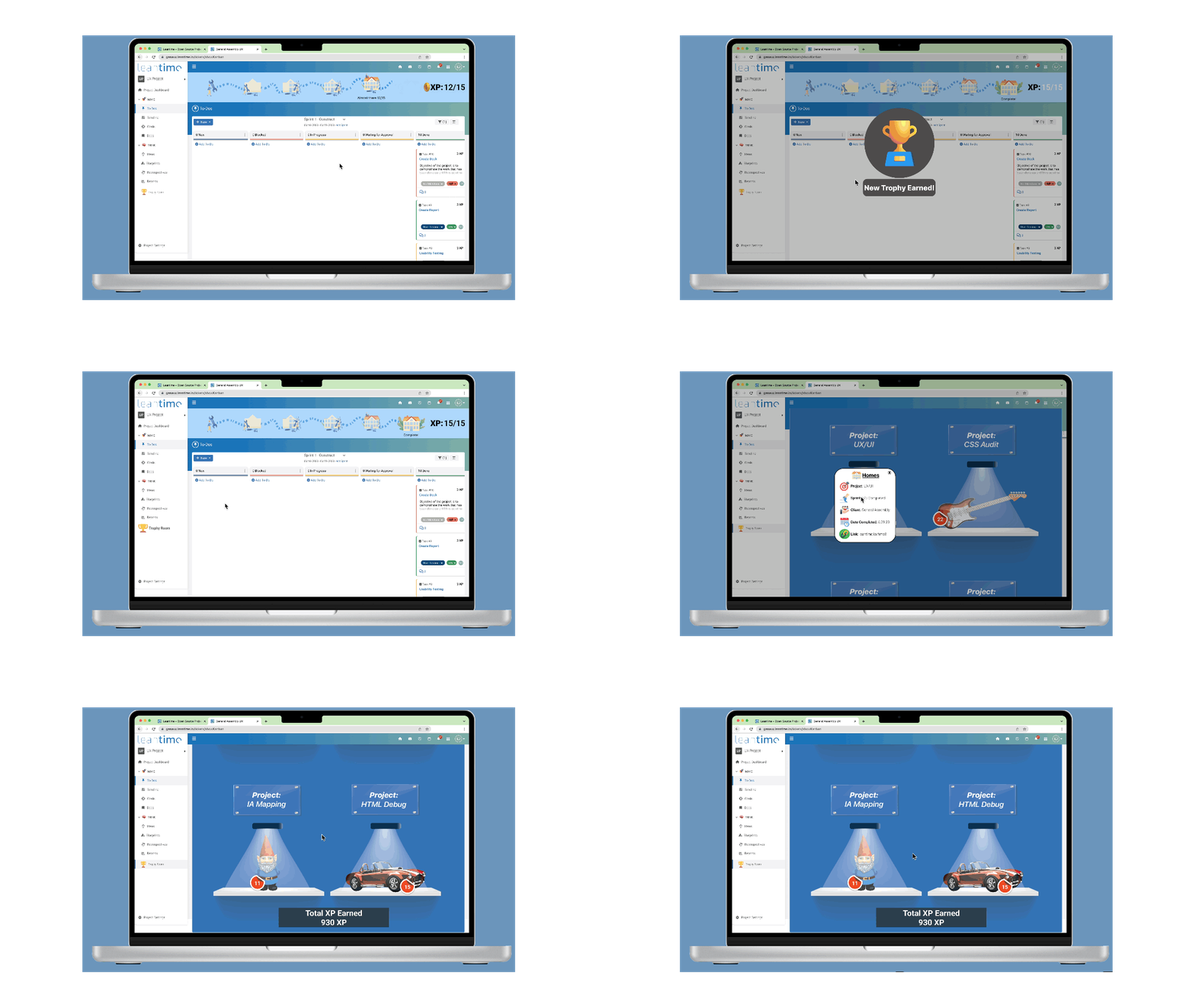
Optimizing for find-ability this required the only UI change on Leantime's platform. We felt it necessary to add a "Trophy Room" to the left aligned menu section
-
Animation showing the trophy being dropped inside the trophy room indicated where a user could find their earned trophies
2
-
A modal was added to indicate a new trophy was earned after completing the sprint
-
Trophies could be clicked on to open a modal linking to that specific project's details including a link to see the overall summary as we were told conducting research that often users need to look back at old projects
Next Steps
Our team successfully handed over our final designs to the stakeholders via a presentation illustrating our findings, process and final designs. Additionally, Figma files (which provided our design system and all assets), spec document for further design explanation and project report which documented our entire UX/UI process/journey was also delivered for seamless development and integration.
Project Retrospective

Project Timeline
The project's entirety took place over a three week sprint, which led to the consolidation of both the research and design phases in order to deliver a finished product. Ideally with more time we would have amassed more research from actual Leantime users, who were elusive due to multiple factors, instead of users of various project management systems. On the design side of things, we ultimately went straight from Lo-Fi designs to Hi-Fi designs for testing purposes within such a constrained timeframe. Even though our testing results were encouraging, the team and ultimately the user would have benefitted from additional testing along the way to iterate in an agile environment.
Team Collaboration
Working within an Agile methodology we were able to keep track of and task incremental milestones within the three member team. We collaboratively synthesized our research, ideated and prioritized features, and undertook a 'design studio' to conceptualize overall concept and execution. Due to time constraints we did 'silo' some of the workload for maximum efficiency when it came to desk research, user interviews, wireframing, prototyping and stakeholder management/engagement.
Stakeholder Relations
Stakeholder interactions were limited beyond the initial brief, which focused on retention of active users through engagement/motivation within the platform. The platform's UI was recently relaunched with a new design concept so our task entailed incorporating new concepts while staying deferential to the existing UI and designing within its parameters.
Final Thoughts
This project was difficult due to the extreme time constraint - however this also created immense opportunities to work within a hyper-agile environment, promoting quick conceptual thinking, creative problem solving and a refined empathetic focus on our end user's goals, needs and pain points from the outset. I personally enjoyed the fast paced environment, thriving on utilizing all of our distilled data to iterate on a concept as quickly as was possible. By using our synthesis as a north star, I fully understood and trusted that our output would be successful as long as we allowed the data to guide us within the creative process and pushed myself to get the best work out of myself within these constraints.
THANK YOU.
For the project research report, spec documents, prototype, presentation or other documentation send a request to jeremybeckux@gmail.com or click the button below.